Overview
When I joined HEAD in 2019 as their first in-house UX/UI designer, the website was outdated — visually, structurally and functionally.
It lacked UX thinking, had no clear hierarchy, and didn’t reflect the brand’s innovation or premium positioning. The shopping experience wasn’t intuitive, the UI felt dated, and there was little to guide people toward buying.
It was time to build something better — not just a more attractive interface, but a foundation for long-term e-commerce growth.
Team
- Me · Senior Product Designer
- Digital Designer
- Copywriter
- IT Manager
- External development agency
My role
As the sole designer, I led the redesign from concept to delivery:
- Ran UX research to uncover pain points and shopping behaviour
- Worked with every sports division, the IT team and a development agency
- Aligned the brand vision with HEAD’s Chief Creative Officer
- Owned UX strategy, UI design and interaction patterns
- Wrote the key documentation and worked directly with developers
Problem
A B2B catalogue, trying to be a shop.
The previous site was never designed for e-commerce. Its B2B structure didn’t reflect how everyday consumers shop: navigation lacked clarity, content hierarchy was inconsistent, and people struggled to find the right products.
Mobile layouts didn’t adapt well across breakpoints, adding friction to the whole journey. Overall, the site didn’t represent the brand’s evolving identity or support a modern, conversion-driven customer journey.
Process
Identifying the UX and UI issues
I started with a UX audit of the core pages — homepage, menu, product listings, product pages and checkout — using heuristic analysis, analytics and internal feedback.
- Homepage — reused B2B visuals and showed no products above the fold. A carousel of 6–7 banners saw little engagement beyond the first slide.
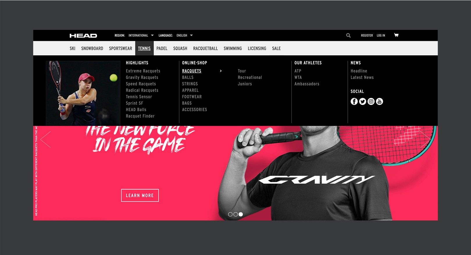
- Navigation — categories were grouped by internal logic, not by how people shop, especially on mobile.
- Product listings — no useful filtering, dense layouts, hard to scan or compare.
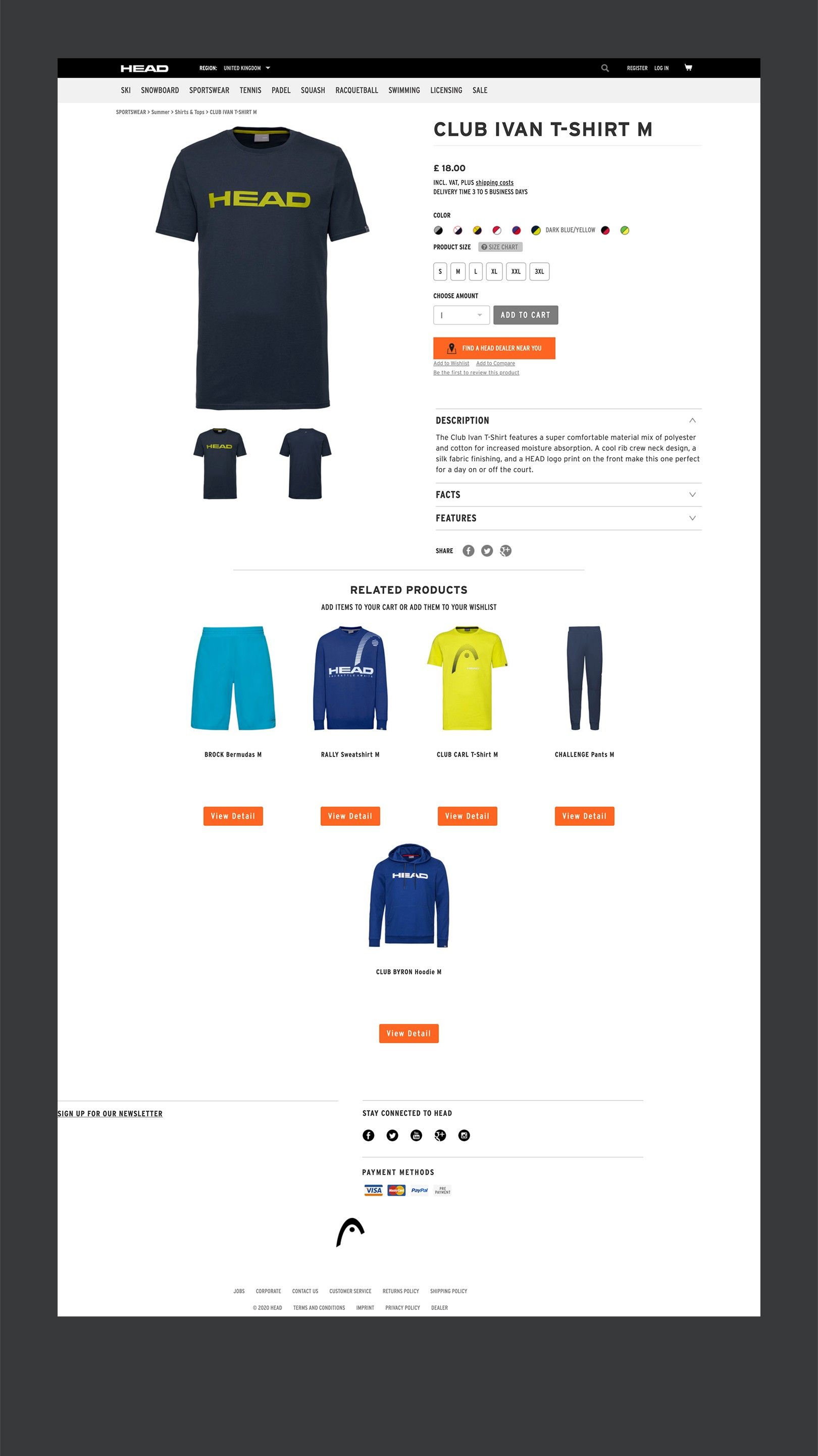
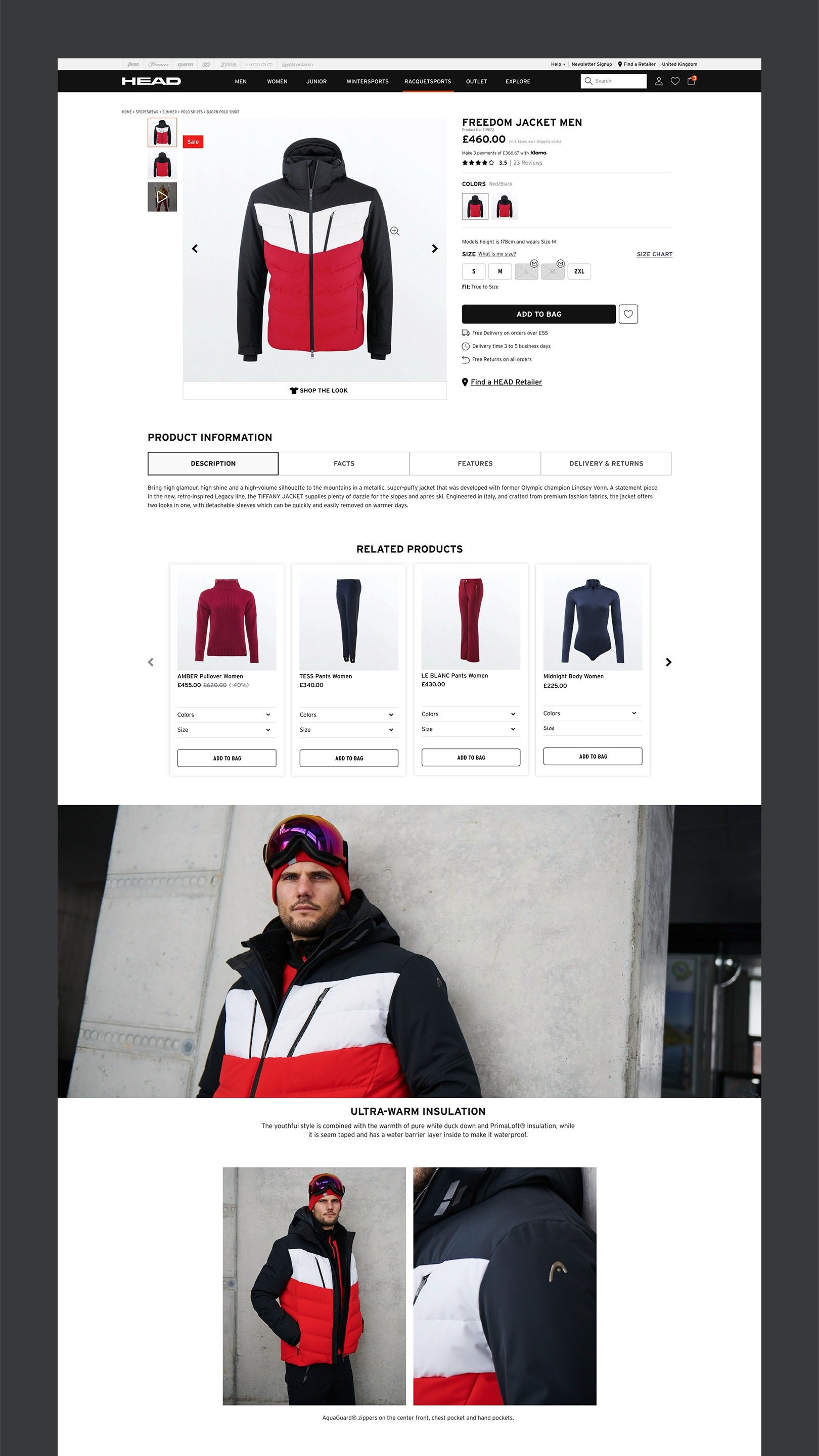
- Product pages — inconsistent typography and spacing, weak hierarchy; key details and calls to action didn’t stand out.
- Checkout — unclear fields, no progress indicator and missing trust signals at the most critical step.
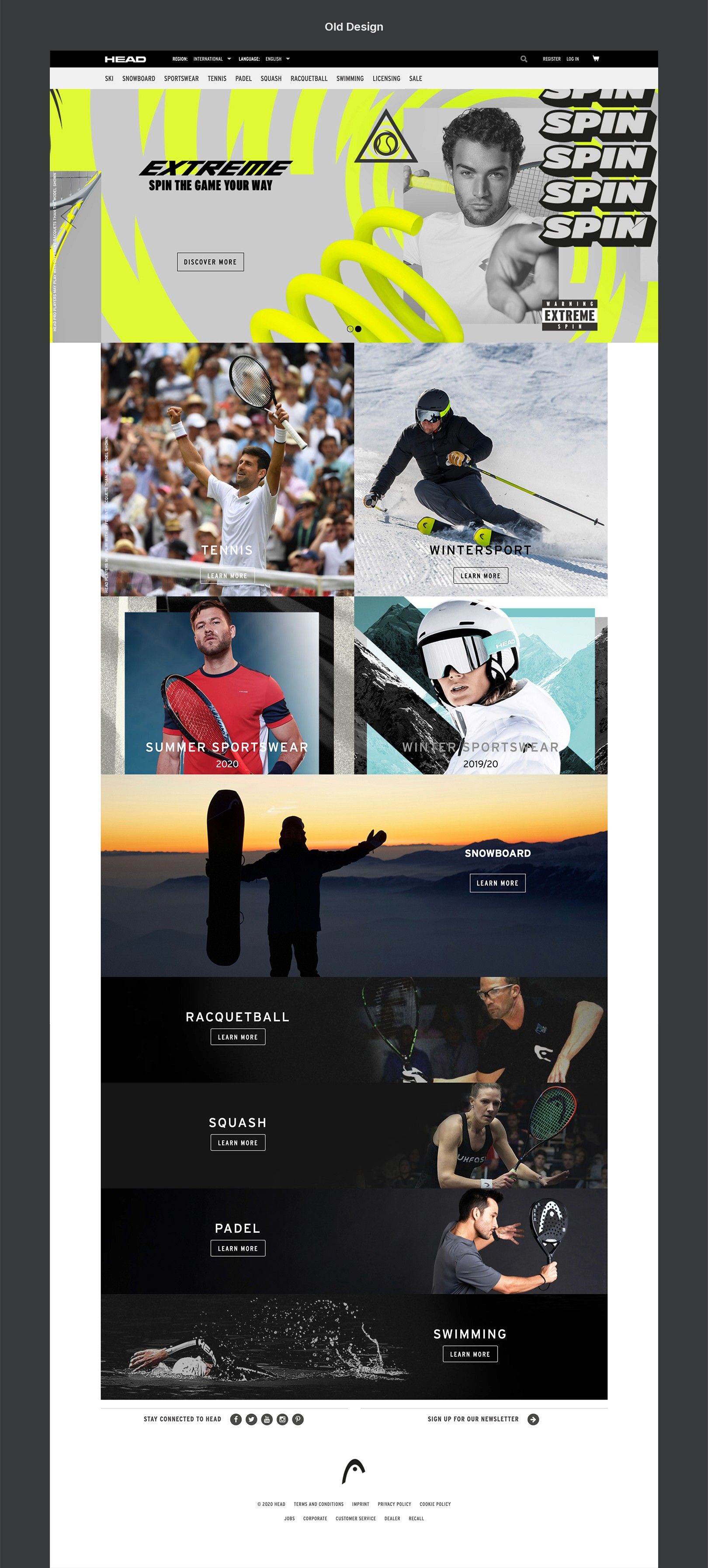
The old homepage.
A catalogue-style layout with inconsistent visuals across sports, many repurposed from B2B campaigns. No products above the fold — missing the most basic signal that you’ve landed somewhere you can shop.
Analytics showed engagement with the 6–7 rotating hero banners dropped sharply after the first slide. The footer was incomplete and hard to find, burying FAQs, returns and contact details — all of which build trust.
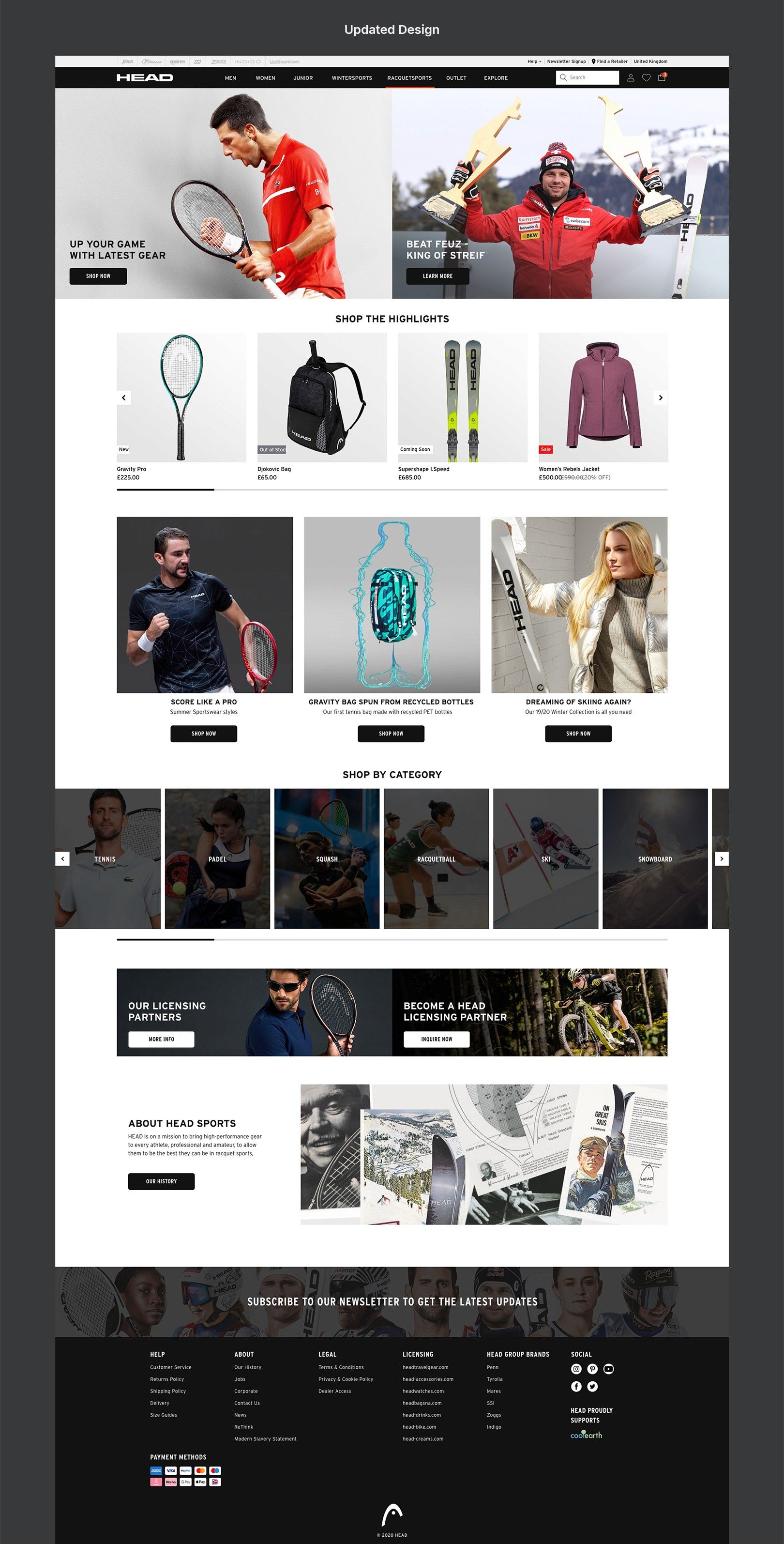
The new homepage.
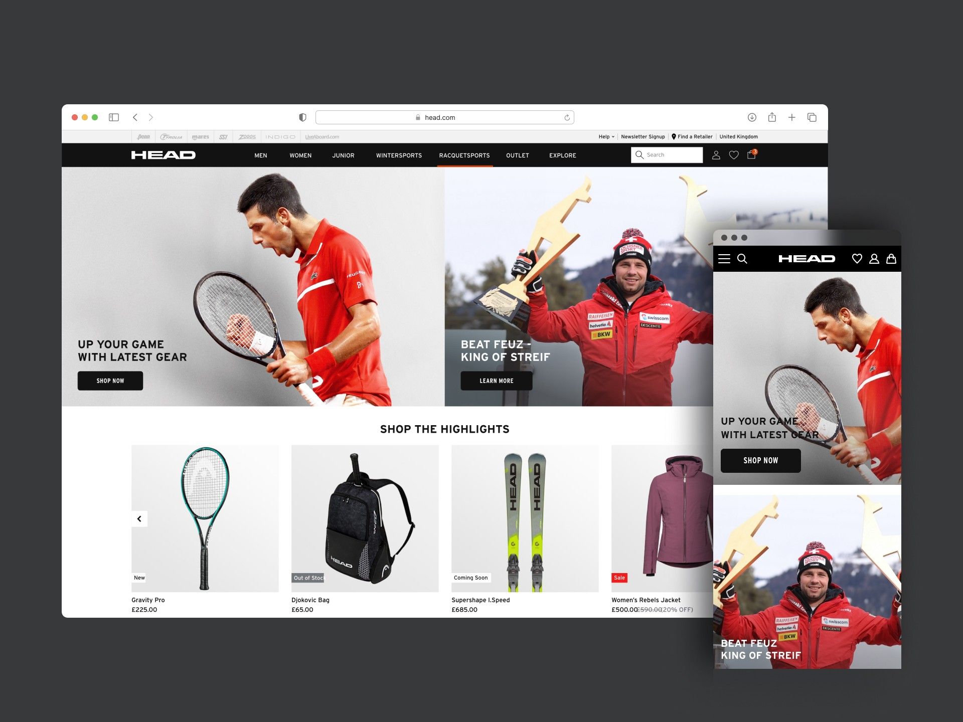
I replaced the carousel with a split-banner hero of two static visuals for more focused messaging, and shifted the content to a B2C mindset — timely news and campaigns instead of static sport categories.
A product widget above the fold made the shoppable intent clear from the first second. Modular content blocks now carry collections, athletes and campaigns, and a redesigned footer groups links clearly and gives the newsletter sign-up real visibility.
Navigation and information architecture
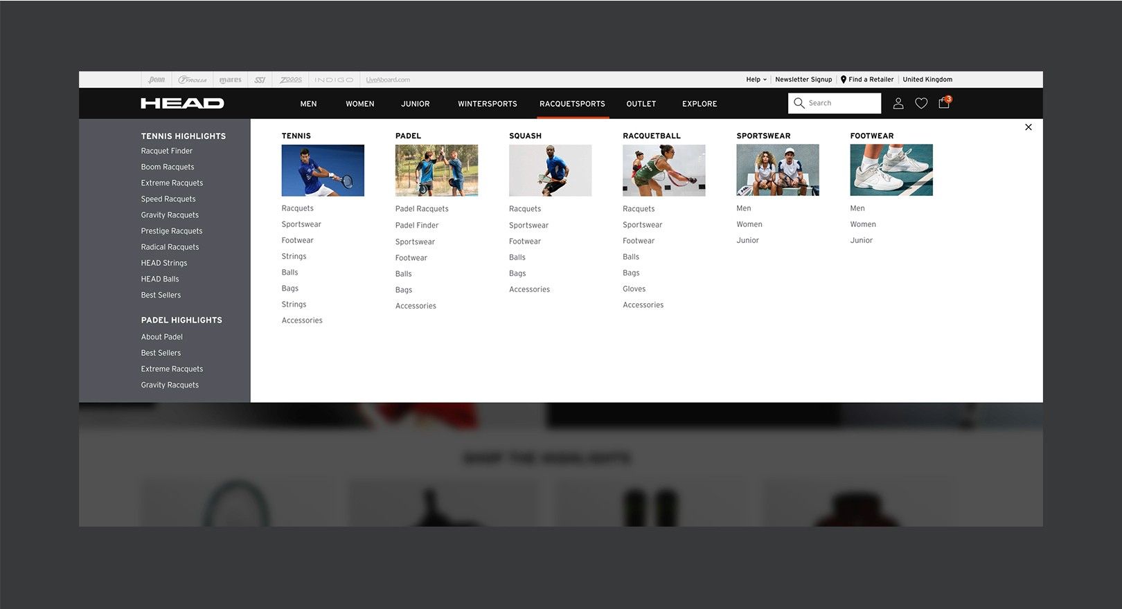
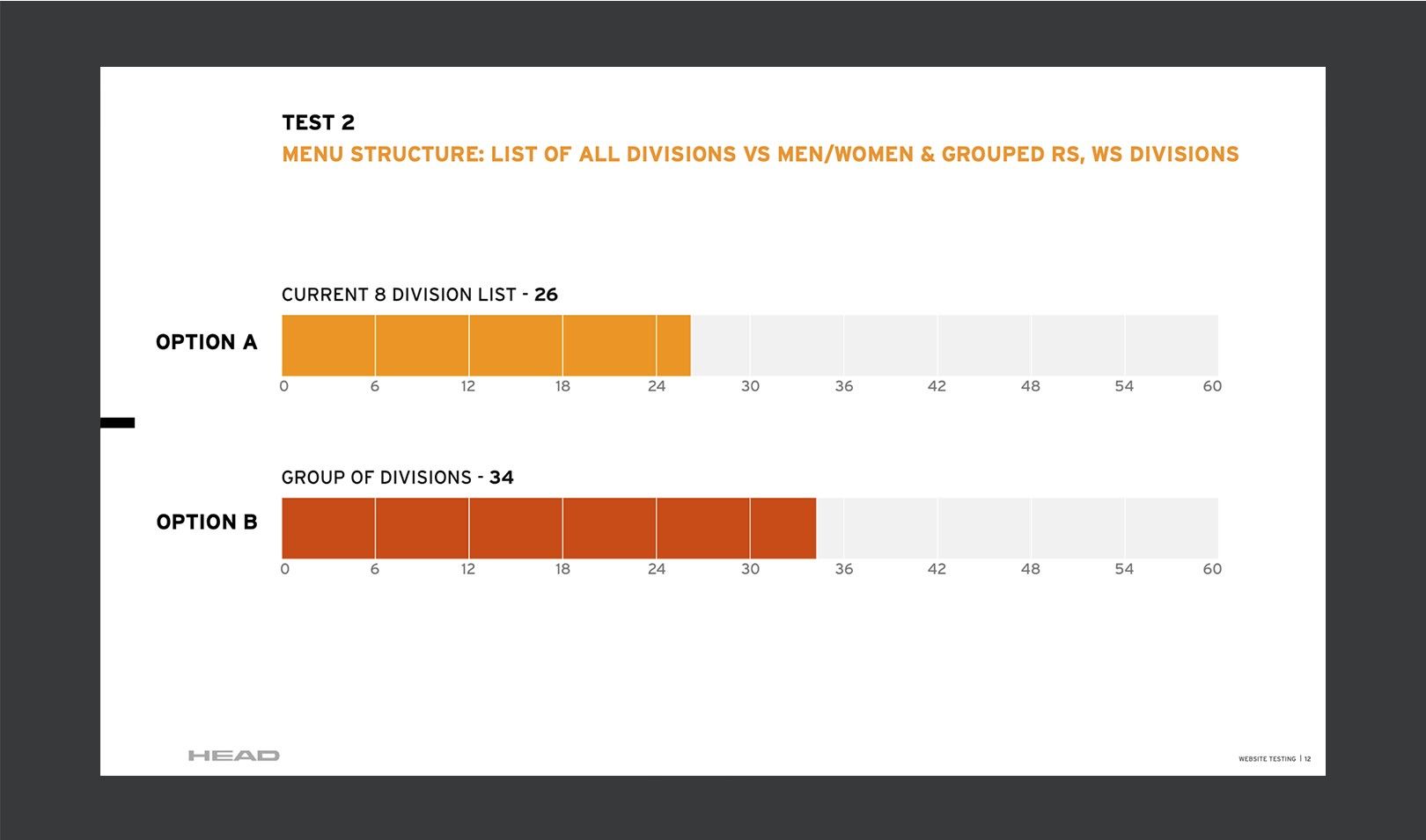
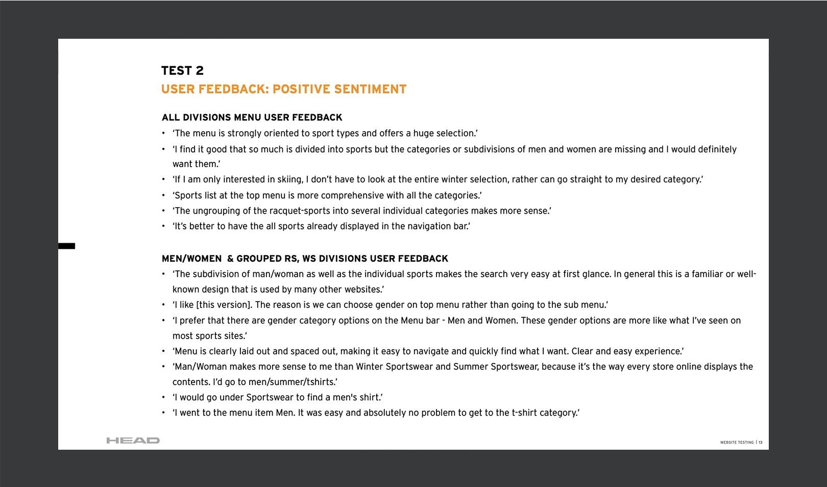
I introduced a user-centred mega menu and rethought the top-level navigation:
- Grouped sports into intuitive categories like Racquet Sports and Winter Sports to reduce cognitive load
- Added Men, Women and Junior for sportswear — matching how people actually shop
- Focused on task efficiency: fewer steps to reach product pages and key categories
User research and competitive benchmarking
I led lightweight research — stakeholder and user interviews, heuristic reviews, and UX audits of competitors and best-in-class e-commerce sites. It gave the redesign three clear goals:
- Make shopping more intuitive, with less friction and cognitive load
- Improve product discoverability to lift engagement and sales
- Better reflect HEAD’s bold, performance-driven brand
Wireframes and prototypes
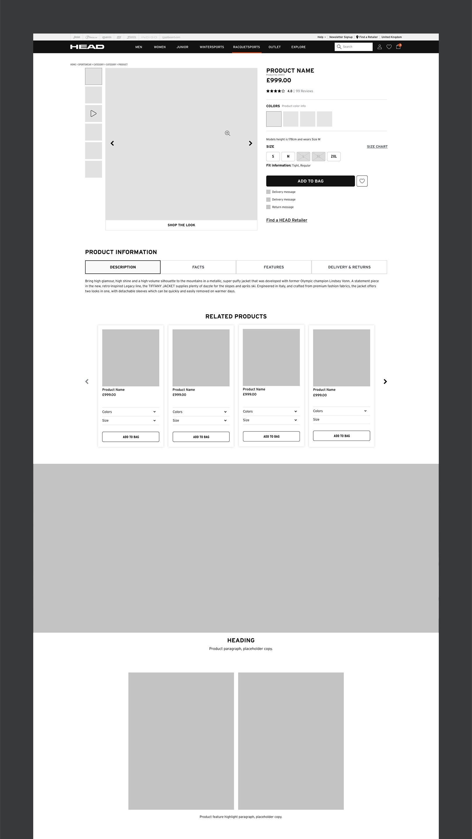
Low-fidelity wireframes fixed the structure and content hierarchy first, without the distraction of visuals. Once validated, high-fidelity prototypes added visual design, brand and interaction.
- Prioritised key content and designed clear attention paths
- Iterated with stakeholders against business and user needs
- Fully responsive across desktop, tablet and mobile
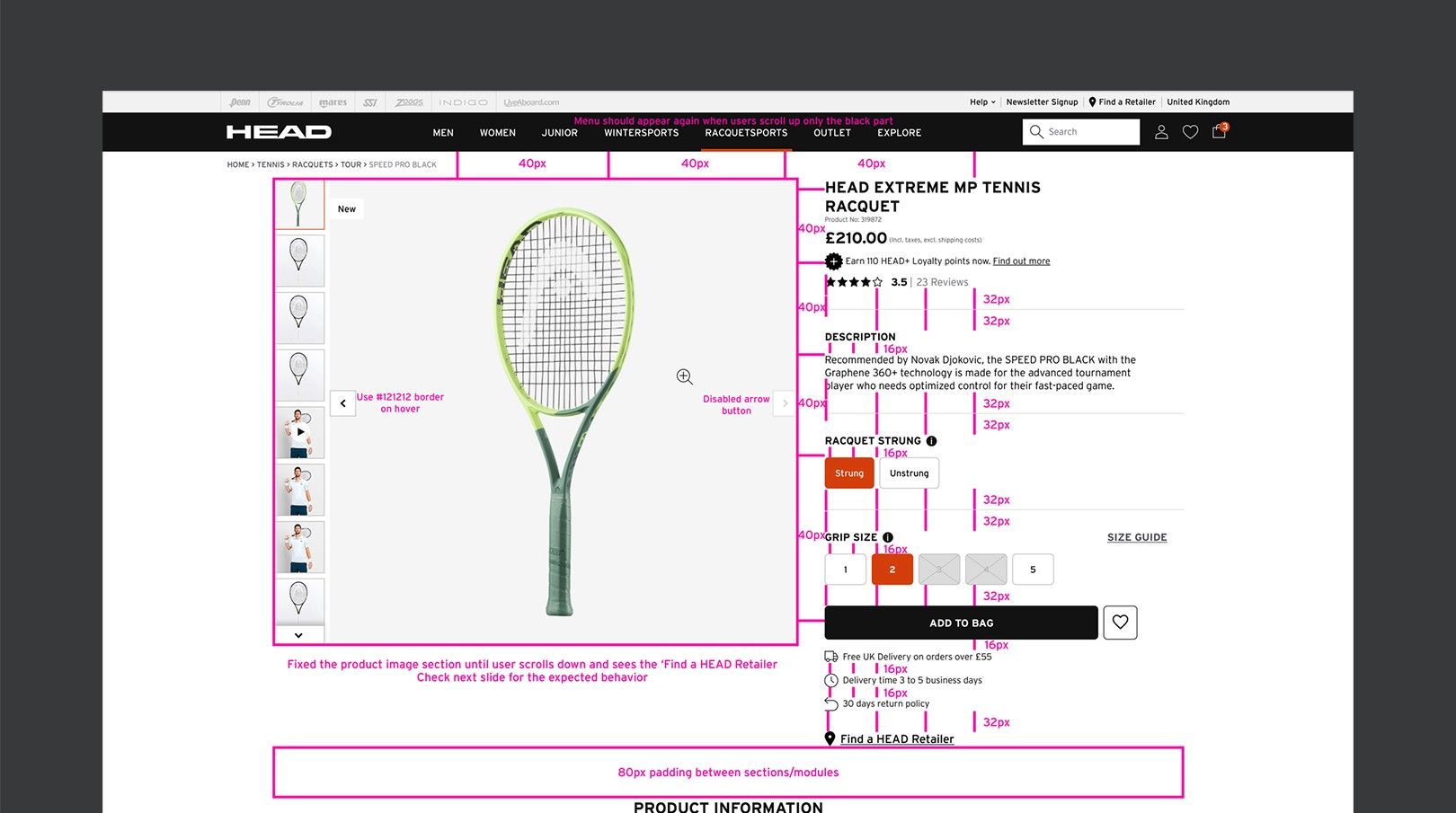
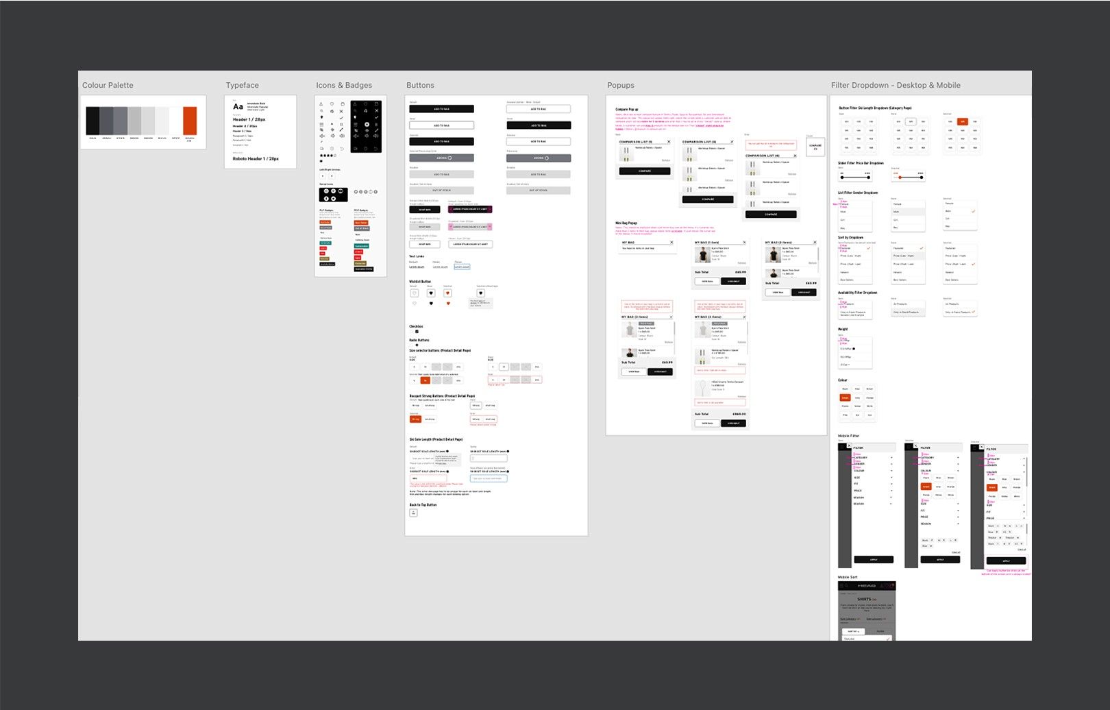
Introducing a visual system
I created a clear design language for HEAD’s digital presence:
- Clean, performance-driven typography
- Stronger hierarchy and layouts
- Consistent spacing, buttons and interactive elements
- Better product imagery and calls to action
- A scalable, component-based approach for future growth
Results
- Conversion rate up 42% after launch
- Sales nearly doubled compared with the previous year
- Internal teams gained a flexible, maintainable design system
- It set the UX/UI foundation for every redesign since, including the 2025 version