The challenge
A premium redesign needs a system from day one.
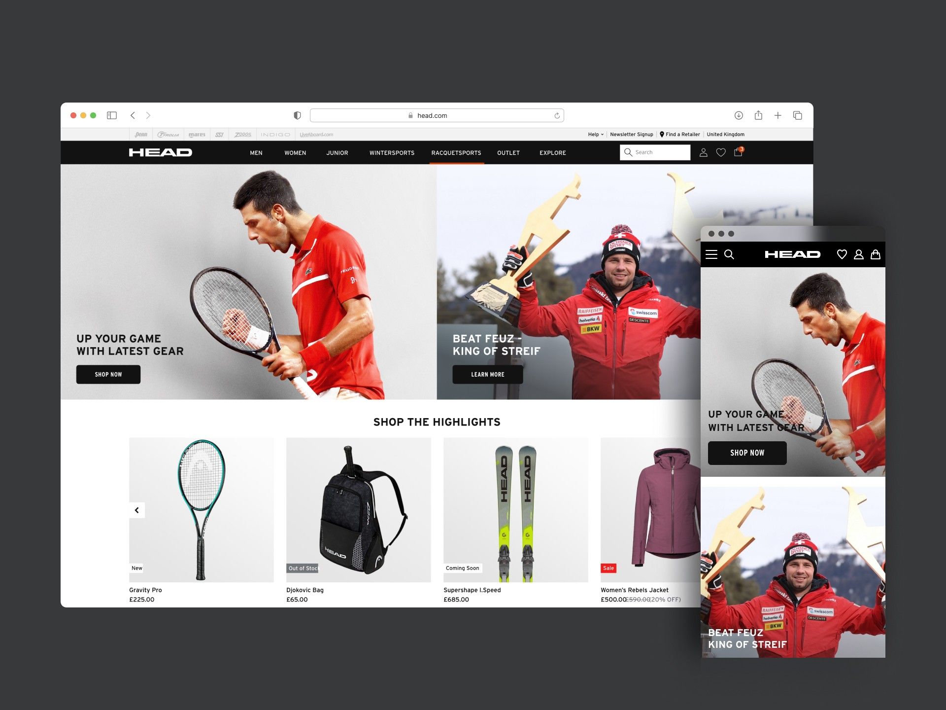
- As we began redesigning HEAD’s global e-commerce site, it was clear that a premium, cohesive experience across every category and page needed a robust design system from the start.
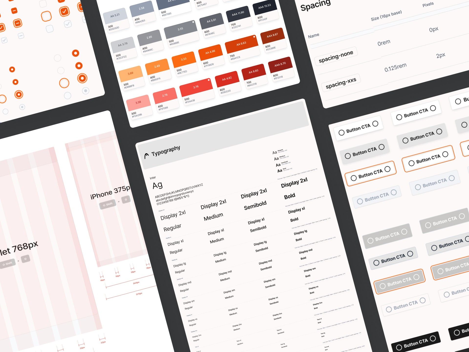
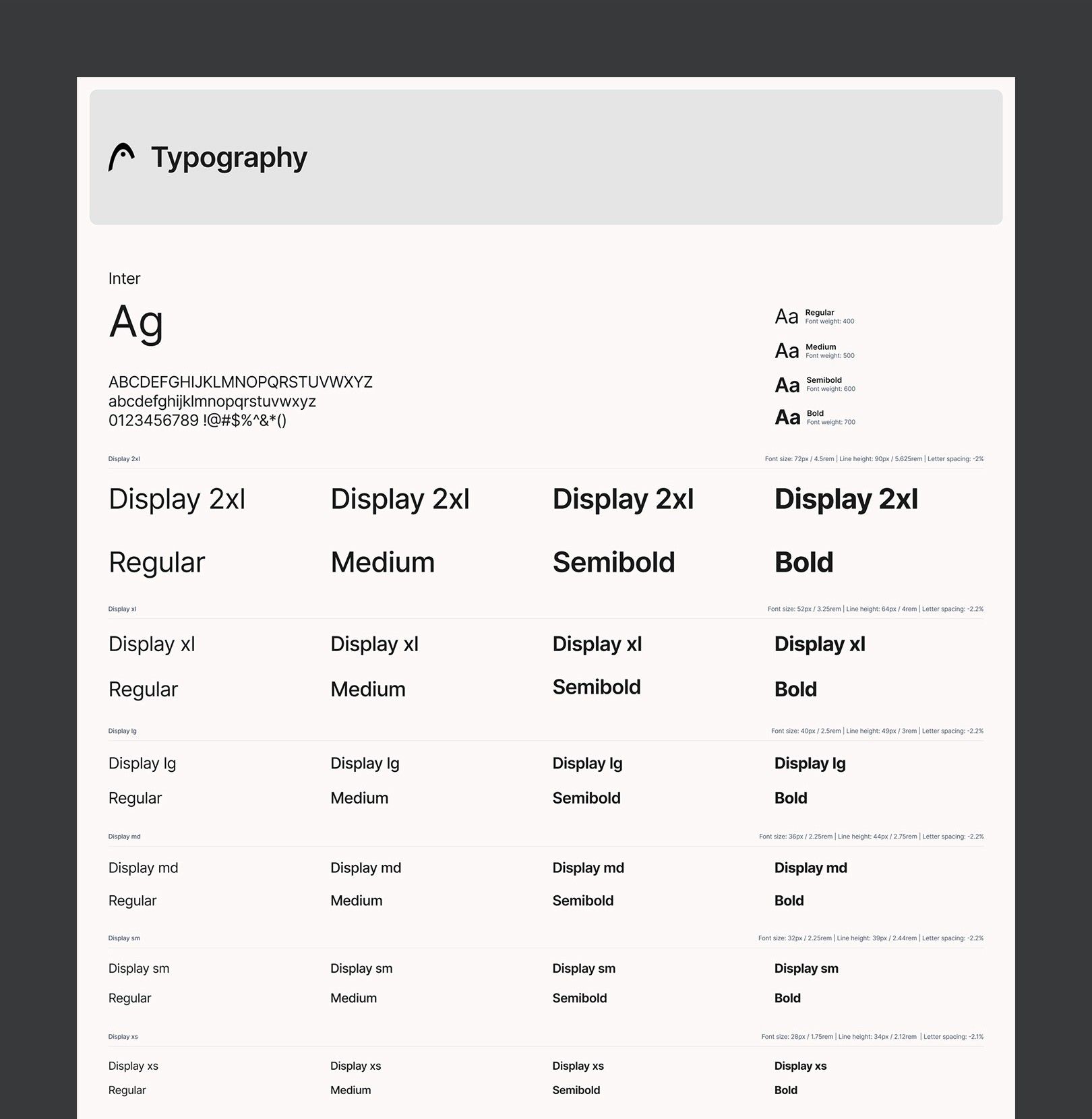
- We needed a single source of truth for typography, spacing, buttons, icons and layout patterns across every device and section.
Team
- Me · Senior Product Designer
- Product Designer
Where we started
Before the website redesign began, we defined a component-based design system in Figma, with four goals:
- Visual and functional consistency
- Faster design and development workflows
- Better collaboration between design, development and product
- Room to scale for future campaigns, features and product launches
The system in action
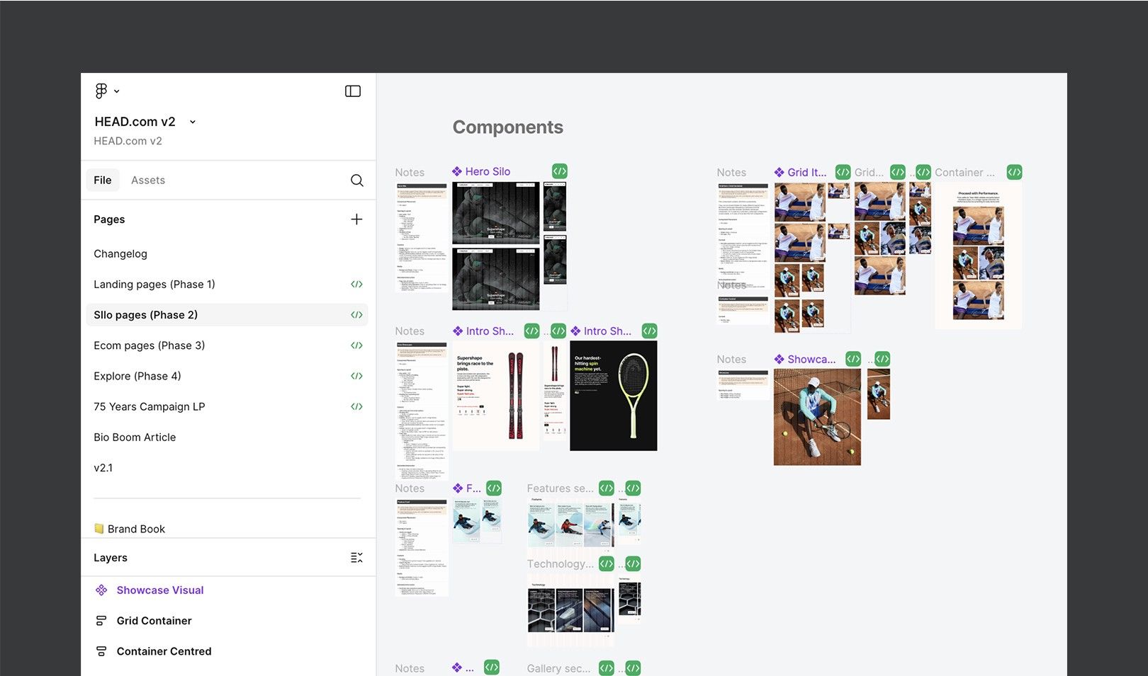
With the foundations set, we built the component library:
- Buttons — primary, secondary, ghost
- Form elements — inputs, checkboxes, dropdowns
- Hero headers with variants
- Product cards
- Feature and technology cards
- Icons
Every component uses auto layout and variants, so it adapts across breakpoints and use cases. We also documented the rules — which component to use when, how spacing behaves, how hover, focus and disabled states work — so any designer or developer could plug in with confidence.
Real-world application
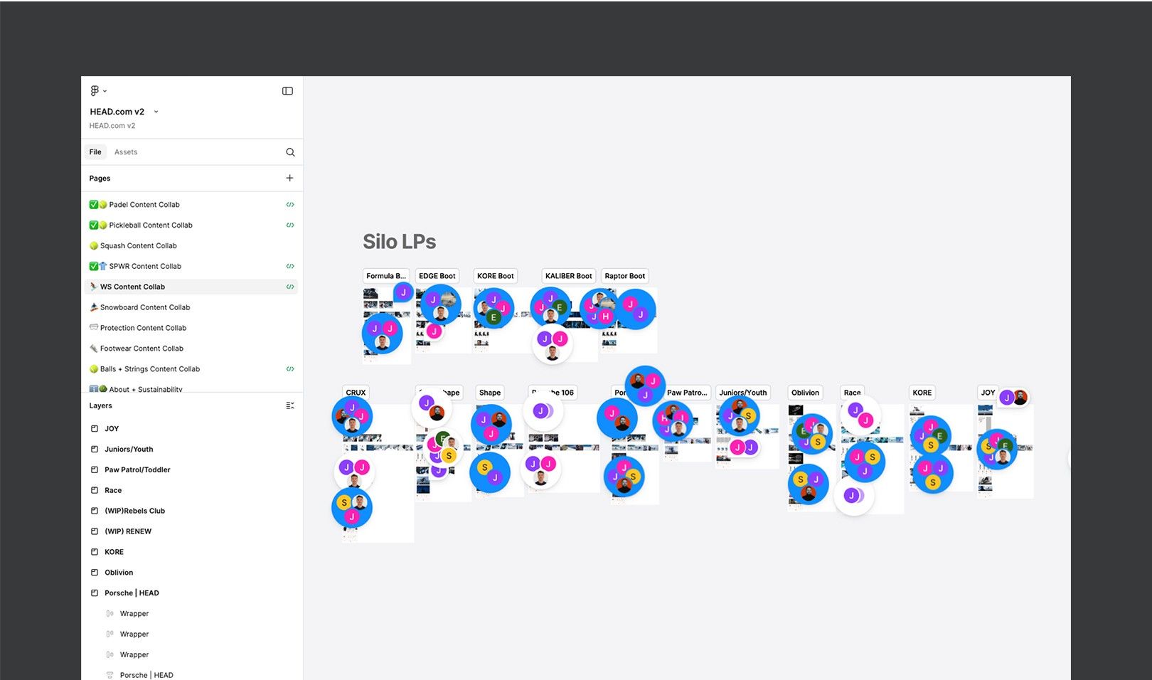
The system wasn’t theoretical. It directly carried the rollout of redesigned:
- Homepage
- Product landing pages
- Product listing pages
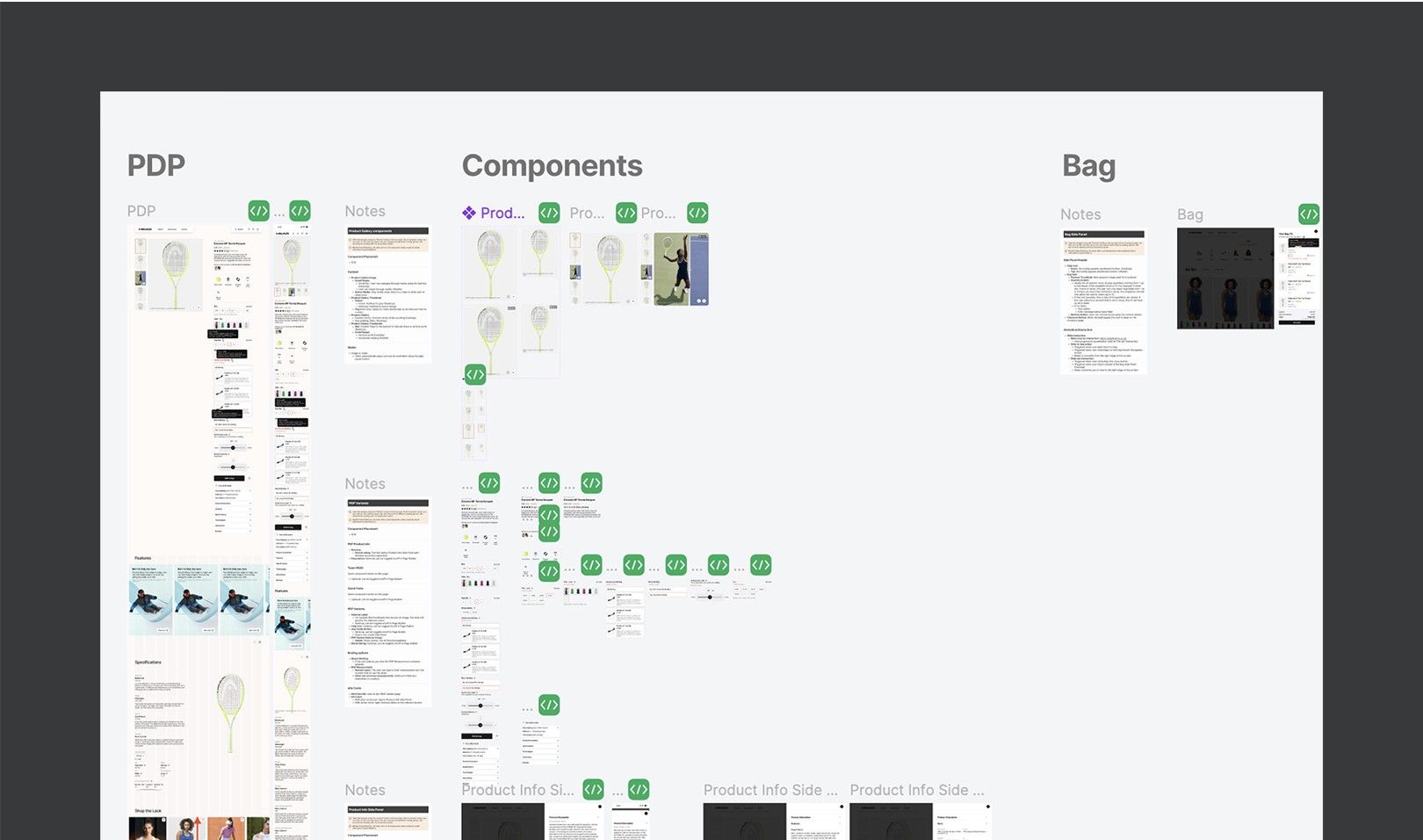
- Product detail pages
- Navigation and menus
- Loyalty programme pages
Reusable components let us test faster, iterate more confidently and stay consistent across a growing number of layouts.
The result
less time to build and iterate new pages, once the component library was in place.
- Better handoff — clearer specs and guidelines, less guesswork, faster implementation, fewer inconsistencies
- Scalability — campaigns and seasonal launches rolled out faster with plug-and-play templates
- Collaboration — external designers and freelancers onboarded quickly into a defined structure
What I learned
Building a design system taught me the value of system thinking, attention to detail and cross-functional collaboration:
- Defining and documenting design guidelines and rules
- Building for flexibility while enforcing consistency
- Working closely with development, marketing and product teams
- Using Figma libraries to run large-scale design work